Why Now? The New Solace Brand Identity Interview

Solace is an established and rapidly growing data movement company in Silicon Valley. Recently, they announced their new name and logo — evolving not only their brand, but also their products.
I had the pleasure of discussing the new brand with Greg Barr, the Director of Marketing Strategy at Solace. Here’s what he shared:
Why did Solace embark on a rebrand? Why now?
Over the last year or so our engineering team has made some exciting advances and our executive leadership has shifted our strategic focus, which together justify a new brand. Basically, we’re modernizing the way our customers can work with our product. We used to just sell one big box that routed data efficiently, but last year we introduced a software product to make our technology applicable to more use cases.
And we just announced a strategic commitment to support all of the different open APIs and protocols for data movement, and to run natively in all public and private cloud environments.. This lets companies, developers in particular, use the tools that work best for them to build, run and scale their applications.
As a big part of this, Solace is adopting a Silicon Valley mindset — embracing collaboration, encouraging people to share ideas and code, even offering a free version of our product. We wanted our brand identity to reflect a more modern way of developing data movement solutions, and within this context, a brand update made sense.

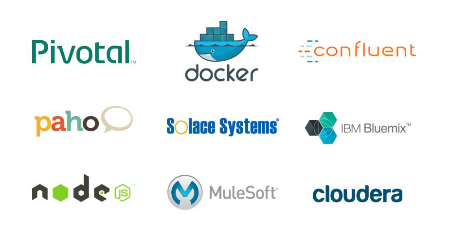
The original Solace Systems Logo surrounded by competitors did not fit in with the new, updated vision of openness and collaboration.
How did you get to this solution?
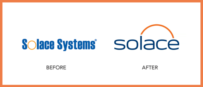
Solace is the most important word, but in our old logo the word Systems had equal weight. The text of the old logo was a fairly recognizable font called Impact, which is very “dense.” Finally, it was a very wide, short logo – in spaces of equal height and width like circles and squares it looked like a stripe across the middle. Then, when placed in the context of our current competitors and peers, which includes cloud companies and open source projects, our old logo did not really fit with our new, updated vision of openness and collaboration.
For starters, we dropped the word systems from our name, then started with simple ideas. Color was important — we had brand equity in the blue and orange, but we shifted the colors to a more sophisticated palette. The orange circle of the letter O in Solace was the most distinctive thing about our old logo, and we had come to use it as a design element in our marketing materials and on the faceplate of our hardware product, so we figured keeping that in some way would be a positive. Choosing the typeface was critical. We wanted something more streamlined and unique.
Originally, we thought we wanted an icon — a clever mark that would stand alone without the word Solace — like all the big brands do (think Apple, Nike, BMW). Yet, we were never able to come up with a visual that told the complex story we wanted to tell about not just moving data, but doing so with unprecedented freedom and flexibility.
We ultimately decided to stay close to home by incorporating the circle into our logo, albeit in a less obvious way, as it allows us to keep using familiar orange circles as a key piece of our brand. I’m really happy with the darker, richer blue and orange we arrived at, and with the much more open, fluid typeface.

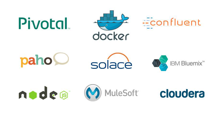
The new Solace Logo is modern and holds its own surrounded by competitors.
What was the biggest challenge in this process?
Anything you’d do differently?
The first major challenge was that our positioning was still being defined when we started the visual design process. This caused our creative thinking to shift as we explored new ideas and taglines. I recommend nailing down the positioning first, then starting the visual brand process.
The second challenge seems strange to say, but I think we had a little too much time. We had 6 months to deliver and other things kept getting prioritized over the branding initiatives which didn’t feel urgent — and of course we were still rushing a bit at the end. For me, a sense of urgency gets things done. Looking back, I could have really used an outside project manager to provide guidance on what needs to be done when, track things from above the fray, and keep us on track with all of the deliverables.
How does social media play a role in your rebrand strategy?
Social media is huge. We have more to offer now that we support the cloud and different protocols, and we want people to know it. Dropping the word Systems from our name helps out on the social side of our branding strategy. Solace is half the character length of Solace Systems, much more compact and memorable, which is huge. Our website URL is now solace.com, and we secured “solace” or “solace inc” handles for our social media profiles as well.
What’s Next?
Rebranding our company is about much more than just a new logo, it’s about a new company personality, a new way of doing things. We want to drive conversation online around what users our doing with technology, and help people by providing things like repurposable demos and code samples. That goes beyond sharing things via the high-profile social networks like Facebook, LinkedIn, and Twitter. It includes fostering discussion and idea sharing among developers where they live, sites and services like StackOverflow, Github, and IRC channels. Everybody on our marketing team is really excited about the opportunity to change the way the market sees our company.
