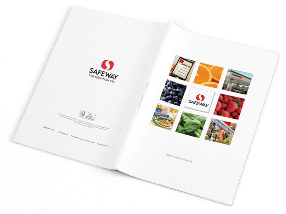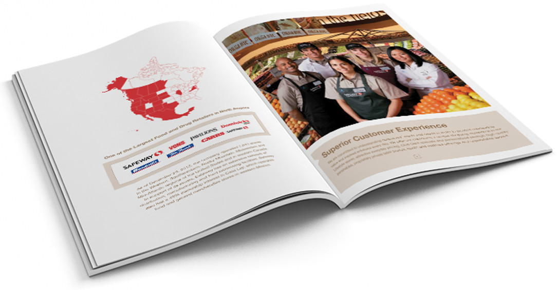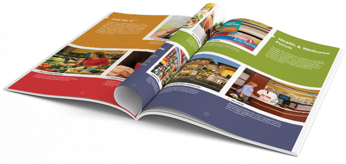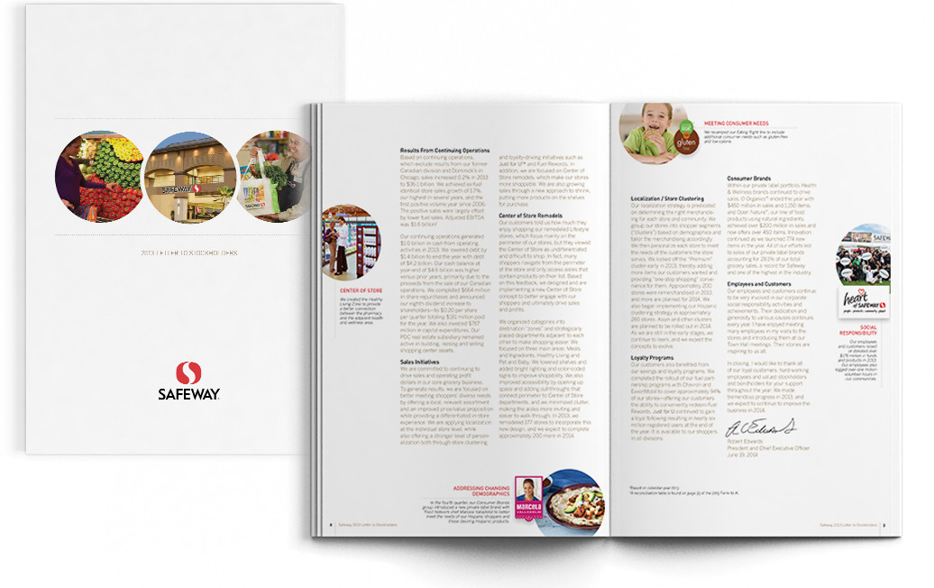
Collaborative Storytelling...
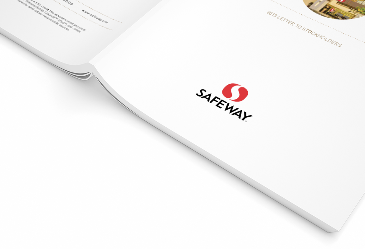
Safeway was tired of the dog and pony show that always accompanied the annual design process. They wanted a collaborative agency that was focused on delivering their messages instead of winning design awards. We were up for the task.
The Approach
I listened. Safeway had strong thoughts about what worked and what didn’t in regards to both the design and the process of producing their annual report. By listening to their needs and sharing our thoughts, I was able to adjust my approach so that it worked for everyone involved. I added an extra meeting in the creative process, so the marketing team could see and review designs before we presented them to their board of directors.
The Process
I identified that quick and honest feedback was essential. Both sides committed to be available on specific, scheduled days, so everyone had the information and resources they needed. Open, consistent communication kept everything moving smoothly — on schedule and stress-free.
Benefits Over Years Past
- No “big reveal” and theatrical presentation of creative concepts — we sat around a table and discussed ideas and messaging
- Both sides committed to quick acknowledgments of communications and needs
- Our team dedicated specific days to be available at the end of the process for immediate turn-around of edits, keeping us on schedule and allowing for a swift c-suite sign-off
- A solid relationship with our print vendor allowed us to get creative about how to best print and deliver the final project
The Results:
Not only did Safeway deliver a well-designed annual report that highlighted their core messages for the year, but they also enjoyed a smoother and more collaborative process.
Want a expert design with unparalleled service? We have the expertise.
Schedule a free, no-obligation 30 minute consultation and needs assessment. Spend some time with a creative thinker and get direction on your next project.

